5 File Mistakes That Ruin Card Projects (And How to Fix Them)
Don't let file errors ruin your Kickstarter project. Learn the truth about Bleed, CMYK, and Rich Black. Download our free professional poker & tarot templates here.
BLOG
1/4/20264 min read
Imagine this: You’ve spent months perfecting your tarot deck designs. You smashed your Kickstarter funding goal. You waited 4 weeks for production. Finally, the box arrives. You crack it open, ready to celebrate, only to find...
A jagged white line running down the edge of every card. Or worse, your vibrant neon spell effects look like muddy swamp water.
The "Unboxing Nightmare" is real, but it is entirely preventable.
At VNK Playing Cards, we manufacture millions of decks for creators across the EU and US. We’ve seen—and solved—every file error imaginable. We believe printing isn't just manufacturing; it's engineering. To help bridge the gap between your digital screen and the physical deck, here are the 5 most common production killers and exactly how to fix them.
Mistake #1: Forgetting the "Bleed" (The White Edge Glare)
This is the #1 cause of production delays.
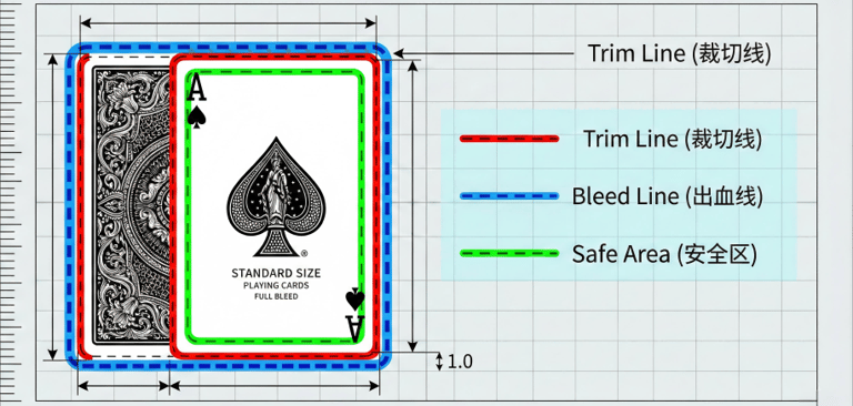
When cards are cut from a large press sheet, the mechanical knife has a tolerance of about 1-2mm. If your artwork stops exactly at the trim line, even a microscopic shift in the blade will result in an unsightly white strip on the edge of your card.
✅ The Fix: Add 3mm Bleed You must extend your background artwork 3mm (0.12 inches) beyond the final trim size to account for cutter variance.
Trim Size (Final Card): 63mm x 88mm (Standard Poker)
Bleed Size (File Size): 69mm x 94mm
Pro Tip: Don't just add a colored border. Extend the actual texture or illustration of your background to ensure a seamless look.
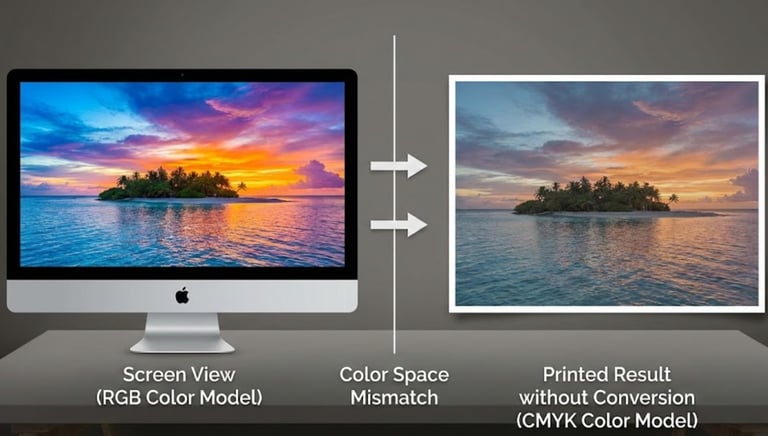
Mistake #2: Designing in RGB (The Dull Color Trap)
The Science: Your monitor emits light (RGB - Red, Green, Blue). Paper reflects light (CMYK - Cyan, Magenta, Yellow, Black).
Many backlit screen colors—especially neons—physically cannot be reproduced with standard ink. If you submit an RGB file, our RIP software converts it to CMYK automatically. The result? Vibrant colors collapse into "muddy," dull tones.
✅ The Fix: Convert Early Set your design software (Adobe Illustrator/Photoshop) to CMYK Mode before you start sketching.
Need Neon? If a specific glowing color is non-negotiable, ask us about Pantone (Spot Color) Printing. It’s a premium upgrade, but the visual impact is unmatched.
Mistake #3: Ignoring the "Safe Area" (The Chopped Content)
Just as the cutting blade can shift outward, it can also shift inward. If logos, text, or borders are placed too close to the edge, they risk being sliced off during the die-cutting process.
✅ The Fix: Respect the "Safe Zone" Keep all crucial elements at least 3mm inside the trim line.
Design Rule: If the information is critical for gameplay or reading, center it comfortably away from the edge.
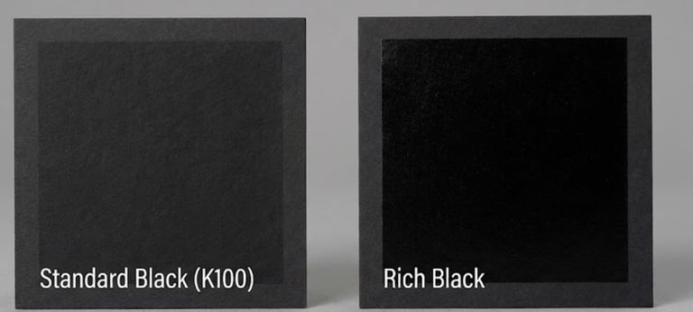
Mistake #4: Using the Wrong "Black" (The Grey Ghost)
Not all blacks are created equal in offset printing.
Standard Black (K:100): Uses only black ink. Crisp, sharp, ideal for text.
Rich Black (C:40 M:40 Y:40 K:100): A mix of all inks. Deep, saturated, ideal for backgrounds.
The Error: Using "Rich Black" for small text causes ghosting (blurriness) if registration shifts slightly. Conversely, using "Standard Black" for large backgrounds results in a washed-out dark grey.
✅ The Fix: Follow the VNK Black Rule
For Text (under 12pt): Use C:0 M:0 Y:0 K:100.
For Backgrounds: Use Rich Black values.
Mistake #5: Low Resolution (The Pixelated Mess)
With the rise of AI tools like Midjourney, we are seeing an influx of low-res submissions. Most AI generators output at 72 DPI (Screen Resolution), which looks fine on a phone but terrible in print.
✅ The Fix: 300 DPI Minimum Your files must be 300 DPI (Dots Per Inch) at the actual physical size of the card.
For AI Artists: Always use an AI Upscaler (like Topaz Gigapixel or Photoshop’s Neural Filters) to boost resolution and detail before placing art into your card template.
Case Study: The "Gold Foil" Disaster We Avoided
Recently, a designer submitted files for a luxury collector’s edition deck featuring intricate Gold Foil on the card backs. On the computer screen, the filigree pattern looked delicate and stunning.
But there was a hidden technical flaw.
The foil lines in the design were only 0.1mm thick. While this looks fine on a high-res monitor, physical hot foil stamping requires a minimum thickness of 0.25mm. If this had gone to print unchecked, the foil die wouldn't have been able to hold the detail. The result? Broken lines, flaking gold, and a "cheap" look for a premium product.
The VNK Intervention: Our pre-press engineer spotted the risk immediately. Instead of printing a defective product, we paused the job and contacted the creator. We helped them thicken the critical lines to 0.3mm while preserving the original aesthetic.
The Result: The final deck featured crisp, durable, and gleaming gold foil. The creator delivered a flawless product to their backers, cementing their brand as a luxury standard.
"I had no idea about the line-weight limits for foil. VNK didn't just print my file; they taught me how to make it printable. The result is stunning." — Sarah J., Graphic Designer
The VNK Difference: Human Pre-press Engineering
Many "web-to-print" giants rely on automated bots to check files. If you miss a bleed line, the bot prints it anyway.
We do things differently.
At VNK, a dedicated Pre-press Engineer reviews every single file before it touches our Heidelberg presses. If we spot a resolution issue or a bleed error, we stop the process and email you immediately. We don't print until it's right.
Start Your Project the Right Way
Don't guess the dimensions. Download our factory-standard templates to ensure your files are print-ready from Day 1.
👉 [ Download Free Poker & Tarot Templates] (Includes: Poker Size, Tarot Size, and Tuck Box Dielines)
Frequently Asked Questions (FAQ)
Q: What file formats do you accept? A: We prefer vector-based PDF or AI (Adobe Illustrator) files. Please remember to "outline" your fonts to prevent any text rendering errors.
Q: Can I see a sample before mass production? A: Absolutely. We offer Hard Proofs. We print a digital sample sheet on your chosen cardstock, allowing you to feel the paper texture and verify color accuracy before committing to the full run.
Q: What is the minimum line weight for foil stamping? A: As mentioned in our case study, for crisp and clean foil application, ensure all lines are at least 0.25mm thick.
Add: Dongci Industrial estate, Shijie Town, Dongguan City, Guangdong Province, China 52300
Copyright 2025 © Dongguan VNK Playing Card Co., Ltd. All Rights Reserved.
CONTACT US
Email: info@vnkplayingcard.com
PRODUCTS
QUICK LINKS